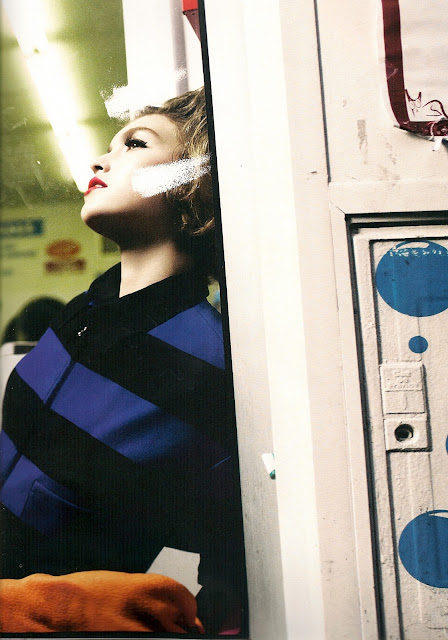
A beautiful editorial taken from the SS 11 Androgyny issue of LOVE magazine. Each two-page spread is showcasing a different set, one page focussing on the model and the other on the surroundings. Kind of like a panoramic shot from the photographers perspective. Some would class this as page wastage, but its actually the opposite. I think it works really well within the whole editorial.


No comments:
Post a Comment